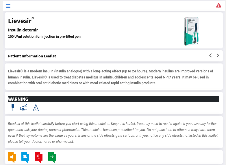
The eLeaflet solution by myHealthbox is now supporting a new Next Generation reference design with a new look&feel, a modern mobile-first UI, an improved template and additional features like real-time alerts, Web-app support and caching.

Customers will be able to select the old-style templates for maximum compatibility or the new reference implementation; with the new support for templates additional custom-made designs can also be developed and plugged-in thus allowing for unique, bespoke solutions.
Why a new eLeaflet reference design
The need for a review of the eLeaflet standard template and UI design arose as more and more users are now interacting with myHealthbox through a smartphone device (latest figures show that over 80% of all sessions are through a mobile device). Particularly, when viewing large amounts of mostly textual data through a small screen, it becomes extremely important to overcome some of the size limitations of these devices through the implementation of mobile specific solutions.
What are the main differentiators when designing an eLeaflet UI for mobile (small screens) or web (large screens) use ?
The main aspects to consider are:
-
one-hand navigation and scrolling (in fact multiple and overlapping navigation paradigms are preferable). Navigation can happen at diffrent levels: horizontally between pages or vertically between sections and within text areas
-
large object selection areas are needed when your mouse pointer is as big as a finger ...
-
dynamic and zoom-able text (both need to be implemented as results are different)
-
correct spacing between text and sections to easily identify areas of interest.
The choice is yours
With the introduction of native support for templates companies creating an eLeaflet will be able to select which UI design to adopt, or even create their own, obviously it is always possible to move from one design to the next.
The old one guarantees for full compatibility with all devices while the new one supports extra features, a more modern look&feel and looks great on the newest mobile devices.
What is new
This is just a short list of what is now available when using the new design:
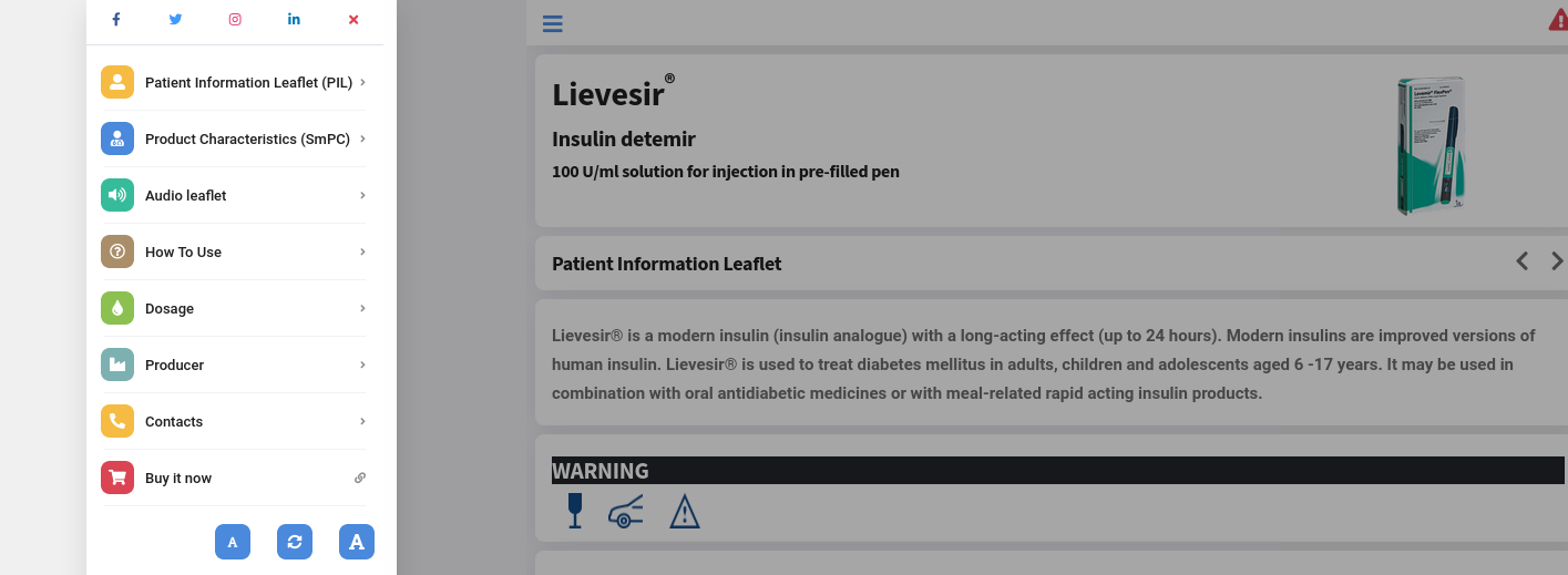
- New menu style for quick access to the different sections: sections can be navigated to via this menu or by horizontal scrolling (on mobile) or via the left and right carets.

-
Full RTL and LTR support: while RTL languages were already supported in previous versions the new design template now adds full RTL support also for UI elements and navigation.
-
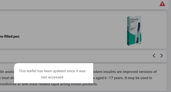
Real time alerts and messaging

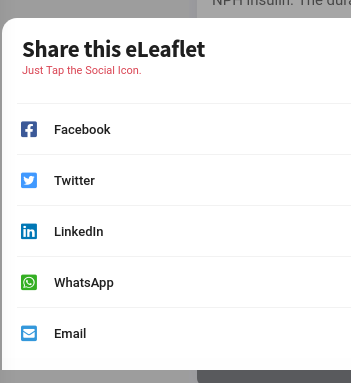
- Improved support for Social features: share the eLeaflet, access product-specific dedicated Social pages, visit the producer Social accounts

-
Improved security with a Blockchain-derived signature key
-
Improved support for eCommerce
-
Improved multimedia and audio support
New architecture
This new eLeaflet Next Gen release does not just mark a new Ui and usability paradigm, lots has been improved behind the scenes, some of the new "hidden features" are:
- full support for templates: templates can now be easily created and applied to eLeaflet content thus allowing for endless combinations and interfaces, use our Reference Design or ask us to create a bespoke one for you
- the new templating support allowed us to create a set of of QRD (Quality Review of Documents) templates, ready to be used and already complying to EMA or FDA guidelines
- eLeaflet can now be "installed" on mobile devices, eLeaflets can be defines as Web Apps allowing them to be installed on a smartphone just like an app, always available and always up to date.
Examples
A reference design for the new Next Gen eLeaflet is available here:
More information about the eLeaflet solution from myHealthbox is available on the eLeaflet website